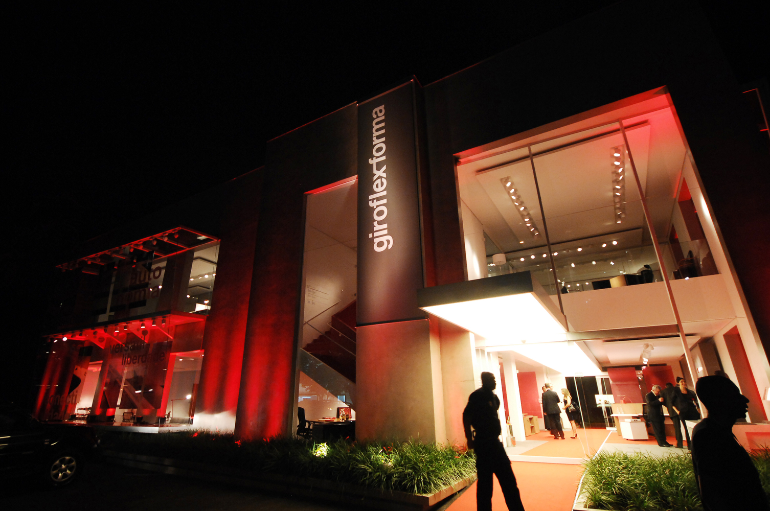
The proposal of the project consisted in creating a new identity for the company that emerged after the merger of the Giroflex and Forma brands, which led to the development of two important work areas: the website and the company’s stores. To develop the proposal, all contact sectors between the customer and the brand were visited. This also included all communication aspects, from stationery to the decals on trucks.
Specifically for the stores, the idea was to create something a little more sophisticated: for the outside area, we designed an element that could be incorporated into all existing shops in Brazil, creating a unified visual: a perforated slab panel displaying the new logo, applied like a second skin to the façade of every store.
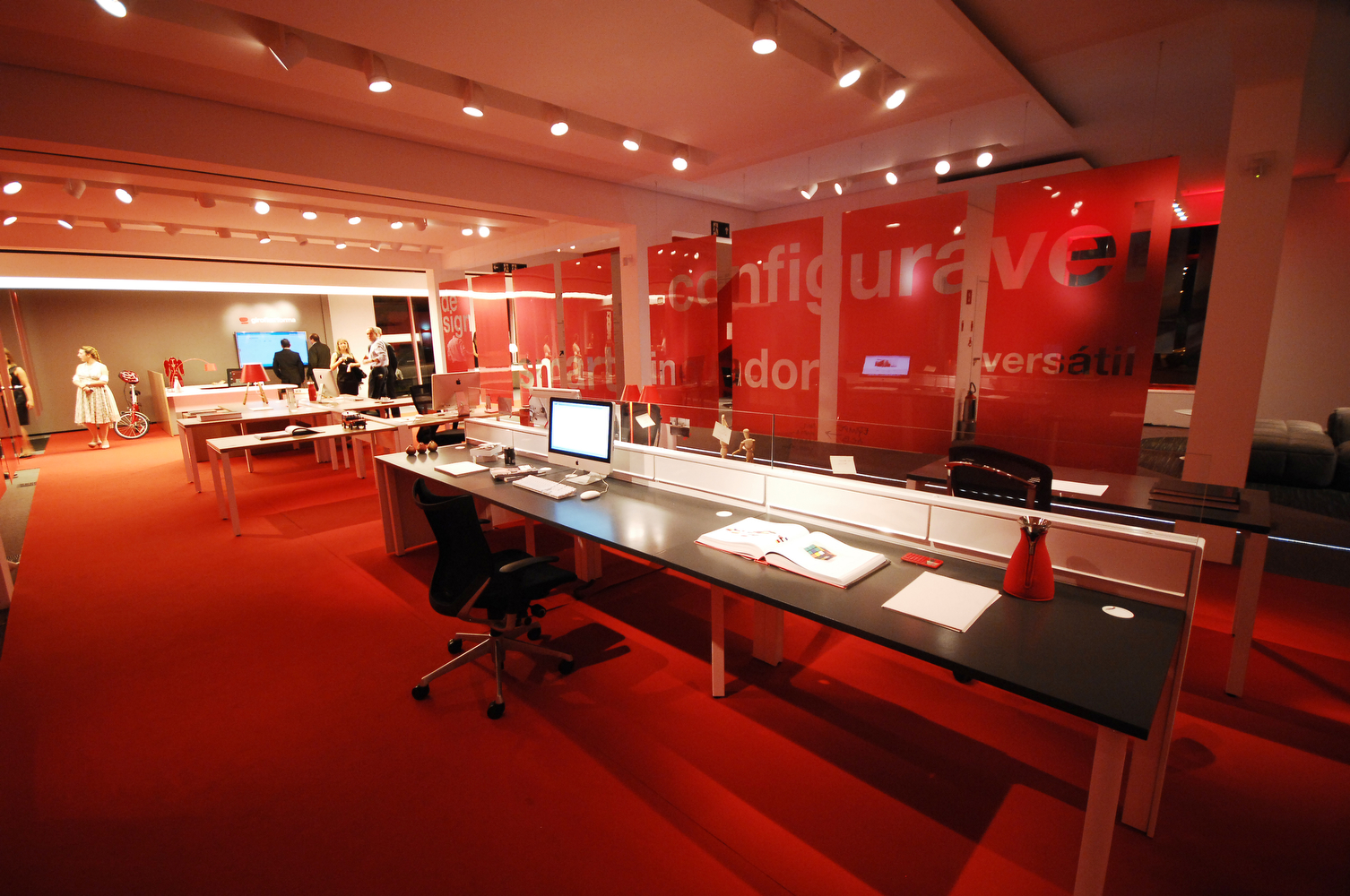
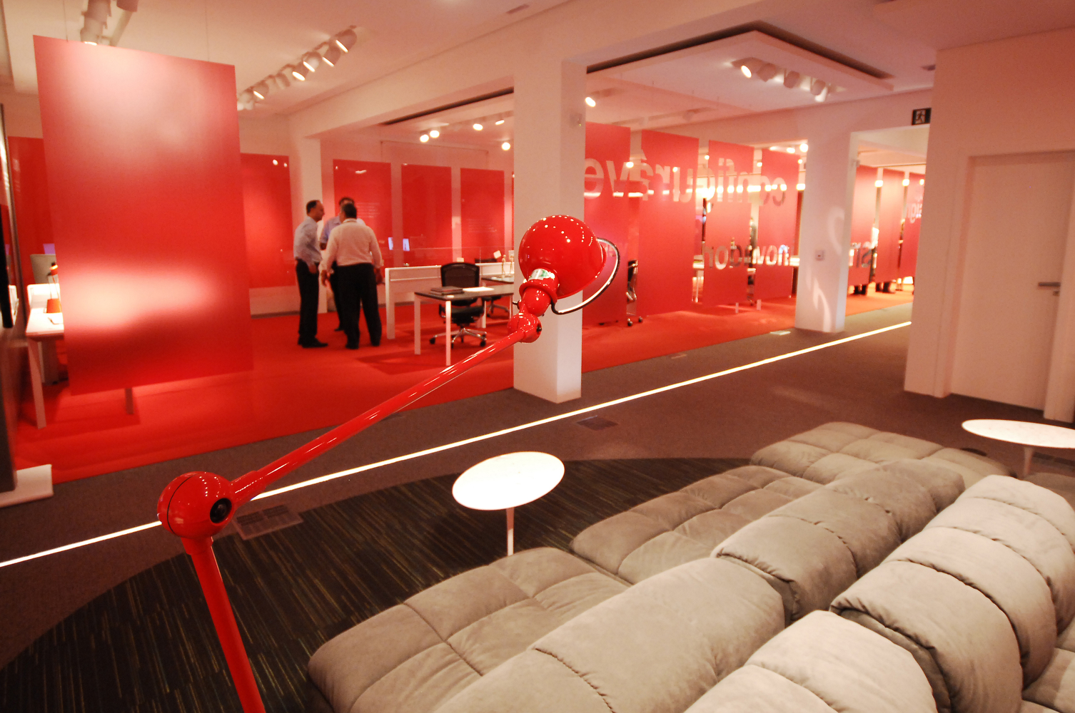
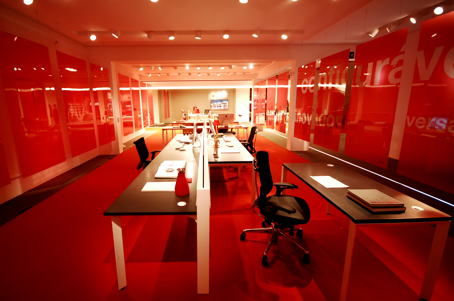
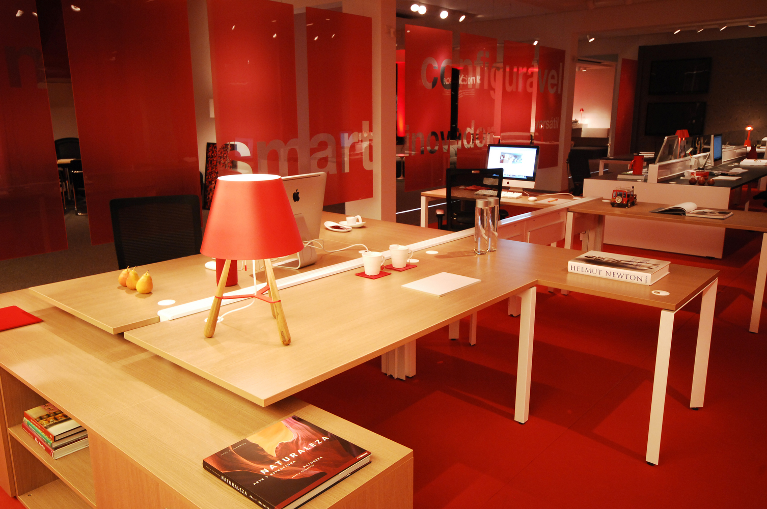
Inside, darker lighting plays with the contrasts of the colorful new identity and highlights products with traditional colors. We also created elements to facilitate the purchase, especially by the end consumer, without the need for greater technical assistance, by providing informational panels.
A large explanatory panel displaying the characteristics of the main models or suppliers offers a fast, efficient and dynamic comparison. Another display was designed for showcasing fabric samples. Before, samples such as formica, glass and wood would just lie around loose. The structured presentation makes it easier to find the items and distinguish them from one another, in addition to allowing customers to create of specific combinations.
A series of icons corresponding to the categories of products and communication panels around the shop help segment the products and provide some information about each space. This ranges from technical details to creating a certain ambiance through the composition of an environment. The concern was to focus on providing tools to assist the consumer.